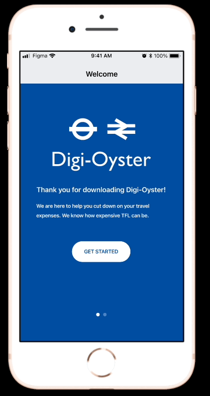
Digital Oyster Cards - A Mobile App Case Study
PROJECT OVERVIEW
PROBLEM:
Frequent commuters often struggle to keep hold of their oyster cards whilst commuting especially during peak times. They often result to using their contactless bank cards on their phones to pay for travel and as a consequence, get overcharged or are unable to save money on travel using the current discounted travel incentive on the oyster card.
SOLUTION:
The app intends to provide a platform where customers can register for a digital Oyster Card and be able to use the digital Oyster Cards to tap in and out of Underground Tube Stations similar to how contactless payments are made at the barriers. The user should be able to open up the app on their phone and tap in and out of the gates, streamlining the commuting process on TFL services.
IMPACT:
I was able to reduce the time taken to top up the Oyster Card by 24 seconds: 45 seconds on the original mid-fidelity app, down to 21 seconds on the iterated hi-fidelity redesign.
MY ROLE:
UX Designer (Group Project), UX Researcher, Interaction Design, Sketching/Wireframing, Prototyping
TOOLS:
Figma, Google Forms, In-Person Interviews, Zoom Interviews, Audio Recordings, Trello, Google Drive
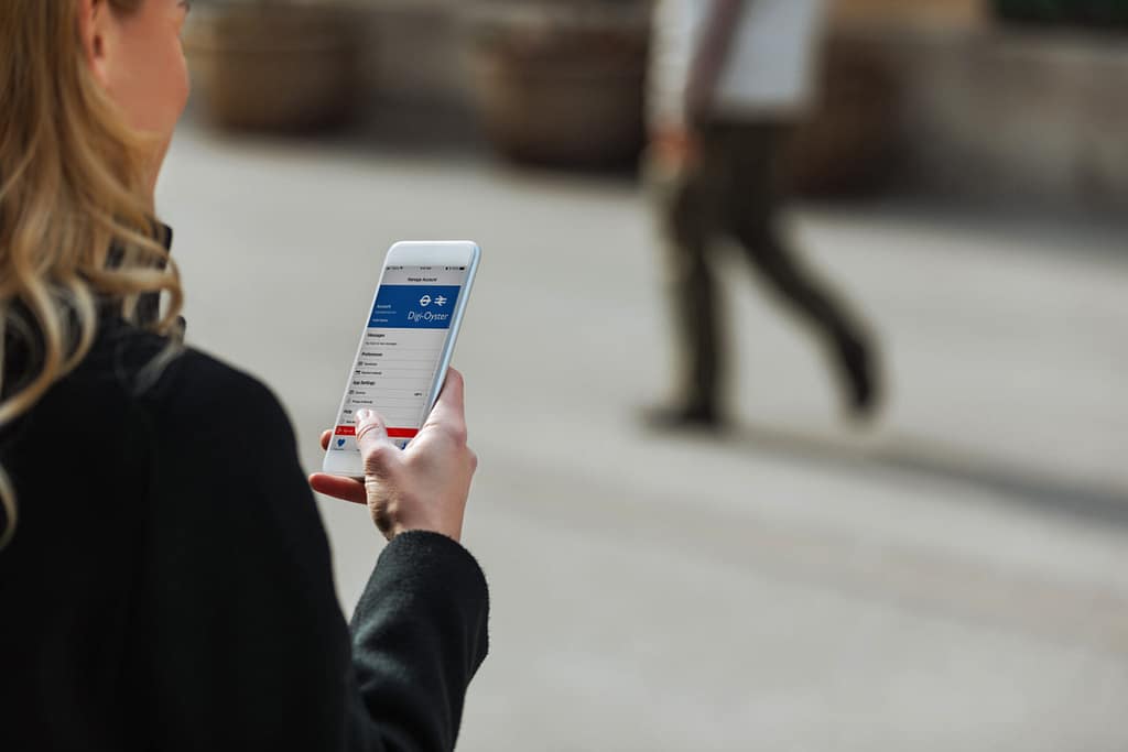
MOBILE PROTOTYPE:
The app will be designed using Figma and will consist of multiple pages with information on how customers can register for a digital Oyster Card and be able to use the digital Oyster Cards to tap in and out of Underground Tube Stations similar to how contactless payments are made at the barriers. There will be an in-built functionality where the user can open up the app on their phone and tap in and out of the gates.
GOAL:
To be able to create a mobile app for TFL users where it provides commuters the option to add their registered Oyster Card onto the app and be able to tap in and out of the Tube stations without needing the physical copy of the Oyster Card. This intends to work similar to how contactless payments works for Apple Pay but the app focuses on Oyster Card users and serves as an incentive for commuters to save money on travel costs so they don’t feel the need to switch over to contactless payments. There will be an option to top up the Oyster Card within the app itself and users can simply open this app if they want to use their Oyster Card on TFL services.
OUR ROLE AND RESPONSIBILITIES:
To analyse the benefits and disadvantages of existing TFL apps and attempt to correct the weaknesses with our prototype design. We will be carrying out research through interviewing frequent London commuters from diverse backgrounds and collating all their insights into one data set. The data set will be used to guide the process of building the mobile app for TFL users that aims to solve the pain points based on the data from the interviews.
TIMELINE:
3 weeks
RESEARCH
In this research project, we planned and conducted 5 interviews (face to face and online virtual meetings) with stakeholders, current users, and potential users in London.
- Online Survey
- Through Google Forms
- Posted to the UI/UX Bootcamp general slack channel
- At least 4 responses in 24 hours
- User Interviews
- 5 user interviews with candidates that corresponds to the user persona
- Location: London
- Commute Method: Public Transport
- Frequency: Frequent
- Lifestyle: Busy
OBJECTIVES
- As a user researcher, I want to understand the user’s thought patterns and the different factors that influence their decision on how they commute on TFL services via contactless or Oyster cards.
- As a user researcher, I want to understand the user’s perception towards the Oyster Card travel cards and find out about how TFL can incentivise commuters to switch from Contactless payments to Oyster Cards.
- As a user researcher, I want to understand the ways of making the commuting process as intuitive and user friendly as possible and to find out about ways to help the user to register and keep using the Oyster Card as their method of travel on the TFL services.
- As a user researcher, I want to find out about the motivations for the Oyster Card and understand their preferences, wants and their reasons for making the decisions they do and understand how to ensure their commute is as cost-effective and streamlined as possible.
PROTO-PERSONA

USER:
Ricardo Galli
BIO:
21 years old; single man; graduate business analyst; lives in Clapham, London with flatmates; commutes around an hour a day to/from work with London Underground tube 4 times a week
LIKES:
Networking, socialising, meeting new people, being organised; getting out of his comfort zone, trying new foods, getting tasks done; plans his time; football, outdoor recreation activities; keeping up to date with business trends
DISLIKES:
Commuting; crowds; pickpockets, cash payments, wasting time, train delays, wasting money, rush hour traffic, having to take out cards out of his wallet
INTERVIEW PLAN
The following questions were used in our user interviews:
1. What do you do for a living?
2. What does your typical work week and weekend look like?
3. What mode of transport do you frequently use and why?
4. Can you describe your habits when using TFL?
5. Why do you prefer xxxx over using xxxx? ( Oyster/ contactless)
6. What’s your budgeting process to pay for TFL? And how do you feel about this process?
7. Tell me about some of the barriers that you feel are preventing you from saving money on public transport?
8. How long have you used your oyster/bank card for public transport and have you ever misplaced or forgotten your cards? How often do you have to renew it? Talk to me through your experience.
9. Talk me through the process of obtaining and keeping your card and what challenges you encountered.
METHODOLOGY:
- Online Survey using Google Forms
- User Interviews – 5 Online Interviews
USER INTERVIEW INSIGHTS
Based on the online survey, this is what we found.

50% of commuters own oyster cards while 50% don’t.

50% of commuters use their credit cards to pay, 16.7% pay via the TFL website and 33.3% via direct debit. 0% of the commuters pay for travel physical in store or at the train station.

83.3% of our surveyed commuters prefer using contactless cards for payment while only 16.7% prefer using the physical oyster card.
AFFINITY DIAGRAM
Using an affinity diagram, we identified key factors for our ideal user and our research revealed that majority of the users preferred to use contactless payments over oyster cards. Challenges included figuring out how to incentivise users to stick to an Oyster Card and help them to cut down on travel expenses in an already expensive city.

USER PERSONA
I created the character Ricardo Galli for my user persona. Ricardo is similar to our proto-persona but has all of his goals, wants, and pain points I learned from our user interviews and survey feedback. Ricardo wants to be able to cut down on his travel expenses and commute as efficiently as possible on the TFL services. He has set himself a goal of reducing contactless payments and increasing his use of travel cards like the Oyster Card – which has prompted ideas for a digitalised version of the Oyster Card via a mobile app.

DEFINITION AND IDEATION
USER INSIGHT STATEMENT
Frequent Commuters across London struggle to save time and money whilst commuting. They need more practical and effective ways of paying for and saving on transport while commuting because forgetting or misplacing their physical cards can lead to stress, disruption in their travel experience, additional costs and anxiety which poses a risk in fulfilling their day to day activities.
PROBLEM STATEMENT
Frequent commuters often struggle to keep hold of their cards whilst commuting especially during peak times. They often result to using their contactless bank cards on their phones to pay for travel and as a consequence, get overcharged or are unable to save money on travel using the current discounted travel incentive on the oyster card. How might we help London Commuters save time and money on travel while commuting so that they can have a seamless experience using TFL services?
- How might we simplify the payment process for London commuters to ensure they always get the best travel rates?
- How might we create a solution that allows commuters to seamlessly transition between different payment methods without overcharging?
- How might we design a system that integrates the benefits of discounted travel incentives directly with commuters’ preferred payment methods?
- How might we help commuters manage and access their travel cards more conveniently during peak times?
- How might we develop a tool that automatically applies the best travel discounts for commuters using TFL services?
- How might we reduce the risk of commuters losing their travel cards while ensuring they still benefit from discounted travel?
- How might we enhance the commuting experience by providing a hassle-free, cost-effective payment solution?
- How might we ensure that commuters can easily switch between different travel payment options without financial penalties?
IDEATION - I LIKE, I WISH, WHAT IF?
Once we defined the problem and gathered all the information from our research, we created an Ideation table (I like, I wish, What if), voted on the best ideas along with a feature prioritisation matrix to help identify the features that are most helpful to the users. We then created a user scenario, value proposition, and a user journey map to illustrate the user experience emotionally.

FEATURE PRIORITISATION MATRIX
We used the 2×2 MoScOw matrix with the variables ‘Complexity’ and ‘Impact / Priority’ to prioritise the most important features for the Digital Oyster Card app.

VALUE PROPOSITION
“Save money on TFL services with ‘Digi-Oyster.’ Manage your Oyster Card digitally through a single app, eliminating the need for physical cards or lengthy online registration. Top up, manage, and register your card within the app, making your commute stress-free and easy!”
Digi-Oyster, in collaboration with TFL, offers an app to manage your Oyster Card and transport expenses from one place. Avoid overcharges and unnecessary spending with features and discounts that incentivize long-term use. This app helps London commuters save money and simplifies public transport, providing a cost-effective solution during the cost of living crisis.
USER SCENARIO
Ricardo has secured his first graduate job and has to commute via public transport for his onboarding meeting at 09:30 am. Cost of living has gone up and Ricardo has bought the oyster card to help him save cost 😀
He leaves home in a rush to catch the tube to Clapham. At the gates, he realises he has forgotten his oyster card at home. He is frustrated and can’t rush back home to get it 😟
He uses his contactless card on his phone and pays the full cost to get through the barrier 😑
He is overcharged the the journey 🙁
Consequently, he arrives to work late and annoyed 😞
USER JOURNEY MAP
We created a storyboard for Ricardo’s journey, who uses the Digital Oyster Card app to cut down on travel expenses. The journey map shows his emotional ups and downs, along with the features and journey defined. We used this as a foundation for our prototype.

COMPETITOR ANALYSIS
DIRECT COMPETITORS
- Apple Pay
- Trainline
INDIRECT COMPETITORS
- Uber
- Bla Bla Cars
While researching the competition, we found a few direct and indirect competitors who had different strengths regarding push notifications, the integration of iOS components, the layouts etc. However, the main weakness identified is that there’s not a single app out there that provides the option for digital versions of the Oyster Card and the sign up process for Oyster Cards had technical difficulties combined with only physical cards of the Oyster Card being present in the market. Our app aims to combine the different strengths of these apps along with providing a platform for digitalised Oyster Cards.


WIREFRAMING & PROTOTYPING
After finalising the user flow, we transitioned to wireframe sketches where I highlighted the key features Ricardo (From the User Persona) would need to meet his objectives.
TASK FLOW
USER FLOW

We each drew the sketches of each wireframe page required for the user flow, outlining the key features and functionality of our app. Shown below.


MID-FIDELITY WIREFRAMES
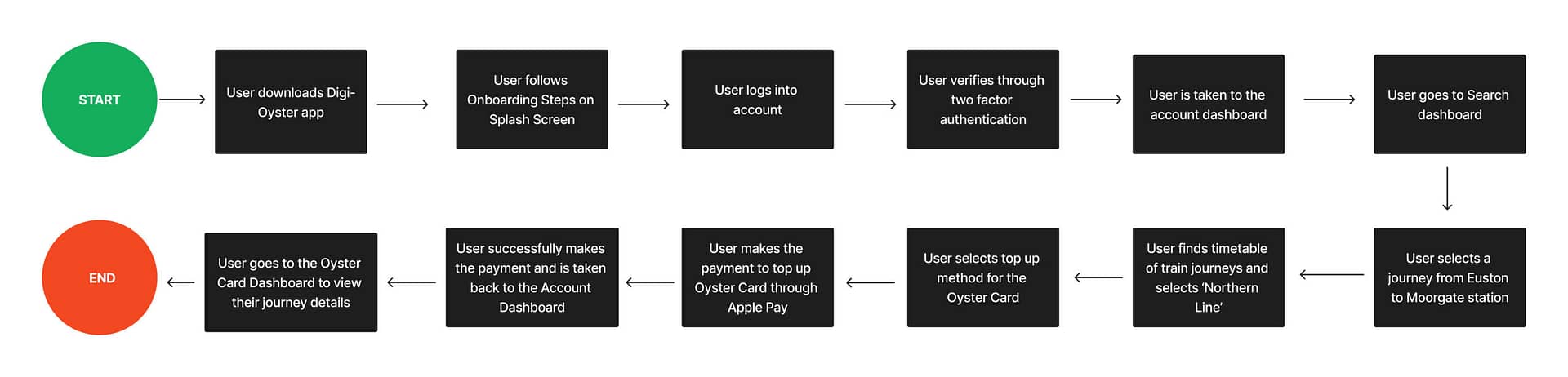
We combined all of our sketches together and created mid-fidelity wireframe flows using Figma. Through iterations, we developed a clickable mid-fidelity prototype and iterated on the wireframes based on feedback received from usability tests. You can view the mid-fidelity wireframes below. Despite initial challenges, our team enjoyed working on creating the digital Oyster Card prototype and achieved results we were all happy with.

The prototype shows the user flow from logging into your account and topping up your Oyster Card for a particular journey. In this case, taking the Northern Line from Euston station to Moorgate station.
TESTING AND ITERATIONS
We created a usability testing plan to get through the user flow on the mobile app prototype. We conducted over 4 different tasks, producing lots of insightful feedback. The tests were carried out through Zoom and the main goal was for us to find out how users understood the features and layout.
GUERILLA TESTING PLAN
Objectives:
- Can a user successfully create an account and log in to the dashboard?
- Do users understand what Digi-Oyster is about when they see the splash page and onboarding screens?
- Can a user successfully top up their Oyster Card for their tube journey on TFL?
Task:
- Log into account for ‘Digi-Oyster’
- Try to book a journey from London Euston station to Moorgate station
- Select the option of topping up the Oyster Card for the journey duration.
- Make the payment, get a payment confirmation and return to the dashboard once the transaction has completed.
Feedback:
- Overall, the design is intuitive. Users were able to navigate through quickly. However, they struggled to go back to the previous page. The back button isn’t visible.
- Make the journey more clear, where back buttons are clear and easy to use
- Make the payment price more specific and make the first section of price and discount the same.
- Make the specific amount more clear, possibly reword it.
- Add teh price of the view ticket, show a collapsible station between.
- The layout is clear and the logo was consistent.
2 RECORDED USER TESTS
We recruited 2 different users to test out the prototype. The tests were conducted virtually using screen recording software because of convenience and referring back to the video evidence when working on iterations for the prototype.
We were able to put together the usability testing notes and created a guerilla testing matrix to figure out the iterations that needed to be prioritised.


KEY LEARNING FROM USER TESTING
User testing taught us the importance of a user-centric approach to solving real-world problems. Users had varied preferences for screens and clarity in the sign-up process, as well as detailed pricing breakdowns. Effective navigation, such as well-placed back buttons, is crucial. Our research highlighted the need for impactful features to maintain Oyster Card use. Ensuring intuitive navigation and clear prompts is essential, and we aim to improve padding, margins, and sizing for better accessibility. Feedback has been invaluable for iterating our high-fidelity prototype, and future iterations will focus on additional features and prioritisation.
ITERATIONS MADE BASED ON USER TESTING
- Payment price more specific.
- The first section of price and balance in the same area.
- Login screen shortened to one screen instead of two.
- Add the price to the view ticket.
- Show a collapse station in between, number of stops.
- Make the ‘Specific Amount’ more clear
- Make the search journey more clear, back buttons should be more clear and easy to use
- Struggled to go back to the previous page, the back button wasn’t visible.
STYLE GUIDE
I developed a style guide for the high-fidelity prototype that closely matched with the official colours used in the TFL apps.


FINAL HIGH FIDELITY WIREFRAMES
From there, I took the next steps and continued working on the Wireframes. I implemented the feedback from the mid-fidelity wireframes and created a high-fidelity version where I added in the colours, animations etc.
The high fidelity prototype made in Figma shows the ‘Digi-Oyster’ app using high quality images and a preview of what the actual app would look like on the iPhone 8 device.

FINAL PROTOTYPE
REFLECTION
FINAL THOUGHTS
- Prominent insight: 98% of users found the oyster card to have no incentives, identifying a gap in the market for TFL and giving us room for more opportunities.
- Team working: We used Trello, Whatsapp, Slack & Daily stand ups to communicate with each other and keep updated on our progress.
- This was a project close to home.
LESSONS LEARNED
I learned that leading a group project comes with its challenges but definitely rewarding in the long-run. This was my first group project and I wasn’t sure what to expect working with the group. I trusted the ideas and vision of my other team members and the collaboration led to the creation of amazing ideas and a design. I also learned the importance of seeking feedback to further iterate the prototype which will help create a better product in the end.
WHAT'S NEXT?
If we had more time to work on this project, we would approach this project differently through:
- Iterating current product sign out button and prompts to ensure that the padding and margins are meeting design standards
- Introducing the “Add to wallet” feature
- Introducing Budget tracking feature to meet one of the features from our feature prioritization matrix
- Introducing Incentives for commuters to get travel discounts and keep them on the app for the long-term