Revamping SANE.ORG.UK: REDESIGNING A NON-PROFIT ORGANISATION'S WEB PRESENCE

PROJECT OVERVIEW
PROBLEM:
People often struggle with their mental health or emotional challenges from time to time in their daily life whilst dealing with the complex challenges of life. They often resort to bad habits that are detrimental to their wellbeing, or in even worse cases, commit acts of self-harm and / or suicide. As a consequence, many family members, friends and loved ones are hurt and traumatised by the serious harm / death of an individual who chose to end their life.
SOLUTION:
The website redesign intends to provide an accessible platform that meets responsive web design guidelines where users can seek out help in a safe environment where they are able to reach out to a support group or a member of the team who can assist them with their problems in a supportive and non-judgemental manner. The redesign will help ensure that users are not overwhelmed or confused when visiting the NGO website for the first time and intends to help them reach their objectives quicker than the current website does. We want to streamline the process of reaching out for support with emotional problems and minimising any irrelevant content on the webpage.
IMPACT:
Our team reduced the time for the Call to Action ‘Help’ by 14 seconds, from 20 seconds on the original site down to 5 seconds on the redesign.
MY ROLE:
UX Designer (Group Project), UX Researcher, Project Manager. I organised, planned, and unified ideas with one other team member in a total of 2 team members. Participated in User Research, Interaction Design, Sketching, Wireframing, Prototyping and Testing.
TOOLS:
Figma, Google Forms, In-Person Interviews, Audio Recordings, FigJAM, Zoom, Trello, Google Drive
DESKTOP AND MOBILE PROTOTYPE:
The website will be designed using Figma and will consist of multiple pages with information on how users can reach out to the NGO for support with their mental and emotional health. There will be built-in features that allows users easy access to the support they need.
GOAL:
To be able to create a website design for people requiring mental health support where users can easily find the support they need without having to scroll or figure out how to contact the NGO. This website intends to cut out unnecessary information and provide the user precise steps on how to chat to an agent. We wanted to create a website that is accessible for someone who would be in a vulnerable position (self-harm or suicidal). There is the option to chat to an agent whichever page the user goes on.
OUR ROLE AND RESPONSIBILITIES:
To analyse the benefits and disadvantages of existing mental health support websites and attempt to correct the weaknesses with our prototype design. We will be carrying out research through interviewing people who have gone through mental health challenges and collating all their insights into one data set. The data set will be used to guide the process of building the website that aims to solve the pain points of mental health users.
TIMELINE:
3 weeks
RESEARCH
THE CHALLENGE
Looking at the UK charity “SANE”, who provide specialised mental health support to those in need. We were tasked to analyse, research, and design a new micro-website which focuses on the delivery of the charity object to assist with relief of the sick with mental illness by use of the website for those in need to reach out and receive help. Our heuristic evaluation of the current website revealed cluttered information, hindered access to essential information. Recommendations included improving the logo, visual design, making calls-to-action more prominent to users, and presenting navigation menu’s effectively. The insights provided valuable guidance for enhancing the usability and engaging users on the website.

The current website for SANE.org.uk
OBJECTIVES
● As a user researcher, I want to understand the user’s thought patterns on how they seek the help they need through browsing Mental Health support websites.
● As a user researcher, I want to understand the user’s perception towards Mental Health websites and find out about how we can incentivise people to reach out for help on these support websites.
● As a user researcher, I want to understand the ways of seeking help for mental health support as user friendly as possible and find out ways to help keep the user engaged on the website and get the help they need.
● As a user researcher, I want to find out the motivations for users wanting to seek help for mental health support, their emotional behaviour, and their reasons why they may struggle to find the help they need elsewhere.
● As a user researcher, I want to understand how to ensure that users are getting the support they need in the most streamlined way possible.
PROTO-PERSONA

USER:
Jeffrey Johnson
BIO:
28 years old, single, works as a Marketing Executive, lives in Central London, by himself, works busy hours every week in a leadership role
LIKES:
Socialising, networking, social interaction, football, video games, movies, food
DISLIKES:
Stress, anxiety, wasting time, wasting money, traditional self-help communities, not being able to open up about his struggles
INTERVIEW PLAN
- Can you tell me a little about yourself and your background?
- What does a typical day look like for you?
- Are you currently working or not?
- Did the COVID-19 pandemic affect your mental health or did this affect you prior to the pandemic?
- How did you identify that you had mental health issues?
- How do you currently manage your mental health?
- What types of mental health resources or support do you use regularly?
- Can you describe any challenges you face in managing your mental health?
- Have you ever used websites or app platforms for mental health support? If yes, which ones and was there a particular experience or function that was really supportive with your needs?
- What features or content did or do you find most helpful with the websites/apps you have engaged with?
- If you were seeking urgent help with mental well being, what resources or tools did you find helpful for getting such help?
- Are there any features or content you find frustrating or unhelpful?
- Was there any journey/process you found such as through the NHS/GP local practice that gave you support effectively, and if yes was there anything that stood out as being really helpful?
- Have you participated in any online forums or support groups? What was your experience like?
- How important is community support to you in managing your mental health?
- What would an ideal community for mental health support look like to you?
- Would/do you find having supportive content for your mental health needs to you by email or SMS helpful?
- What kind of personalised features would you like to see with digital mental health resources?
- How do you feel about sharing personal information on mental health websites? What privacy concerns do you have?
- Is there anything not covered here that you feel would be helpful to advance mental health support resources?
BACKGROUND:
This website re-design is to consider the current iteration of UK Charity ‘SANE’, and develop a micro-site concept that could be later rolled out to wider content. The website is to focus on the needs of the visitors and fulfil the legal obligations of the charity.
GOALS:
In trying to build a new responsive website we want to understand the needs of visitors who do and could come to the website who would provide data points for further research or possible design considerations in the project.
METHODOLOGY:
- Online Survey using Google Forms
- User Interviews – 5 Online and In-Person Interviews
- 20 Questions
The goal is ideally to interview people using Zoom Workplace for video and text based transcripts however due to the loss of a team member we may have to conduct in-person interviews making notes during that process.
PARTICIPANTS:
We are targeting people who live in the UK who ideally have prior mental health challenges they have or are facing to give a well-rounded insight into the project, and are willing to draw on those experiences for the purposes of this research.
SCHEDULE:
We based our interview and collaboration research around our working availability and set interview date options firstly at the weekend when most people would be available, and where not a week day evening. These considerations allowed all the target participants to attend and contribute effectively.
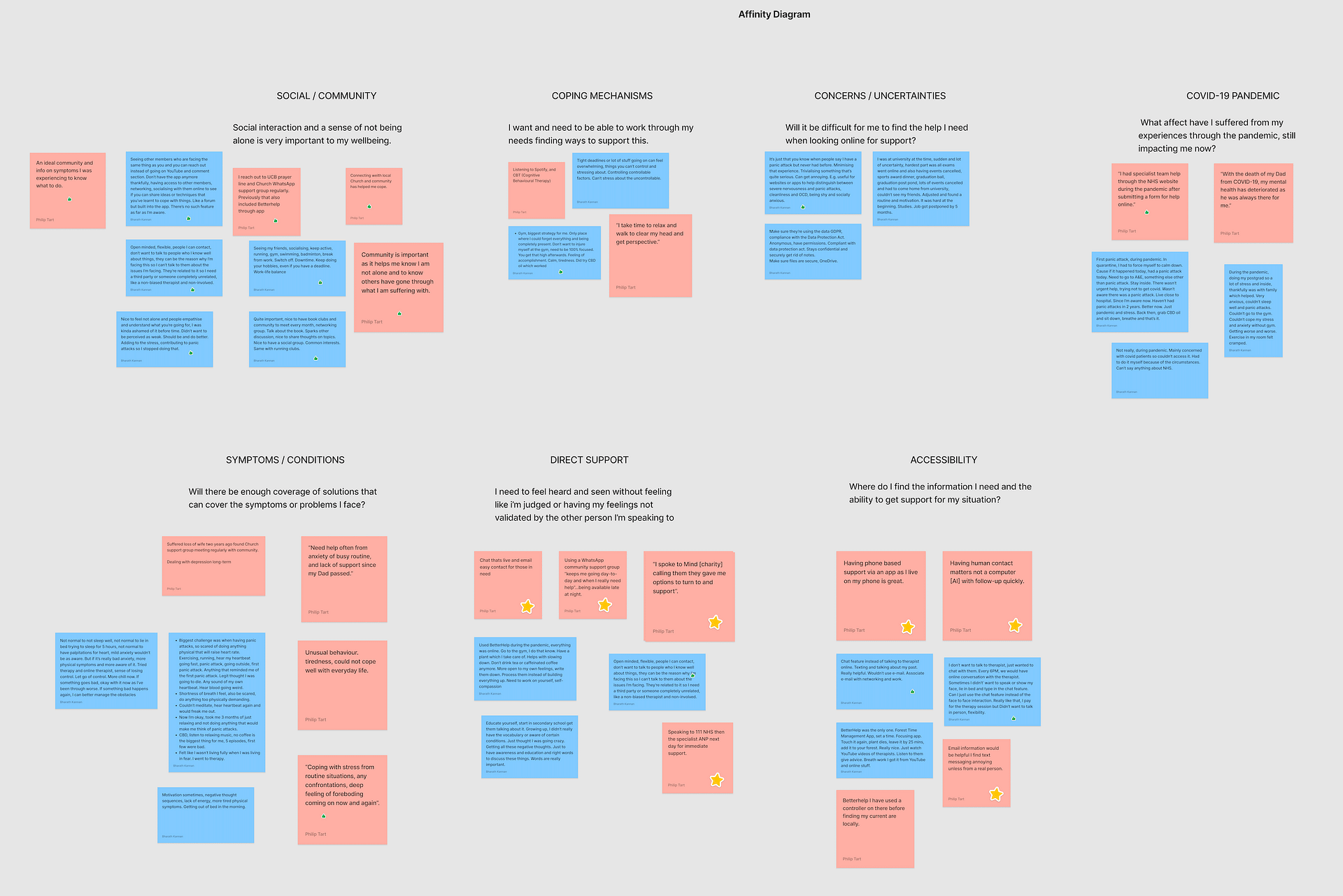
USER INTERVIEW INSIGHTS
Based on 5 User Interviews conducted via Zoom and In-person, here were the insights.


AFFINITY DIAGRAM
USER PERSONA
We created the character Jeffrey Johnson for our user persona. Jeffrey is similar to our proto-persona but has all of his goals, wants, and pain points we learned from our user interviews and survey feedback. Jeffrey is struggling with his mental health and wants to vent for help, but feels a lot of shame and anxiety with asking for help, so he needs a safe environment to seek the support he needs. The current website makes it difficult for him to reach out for help due to the confusing layout and unclear Call-to-actions on the webpage.


DEFINITION AND IDEATION
USER INSIGHT STATEMENT
People are increasingly identifying with the challenges of mental health with symptoms that can be easily taken for granted and and struggle to recognise what they are suffering with. Asking for help is not easy with the labels of ‘crazy’, or stigma of being odd or perceived as being weak in character often resulting in those just ignoring real mental health problems, which is far greater to diagnose compared with physical symptoms.
The pandemic highlighted these realities with isolation and the need for safe places to be honest venting personal truths and get support from real people who can help or have been through the same journey. With the life-impacting risk of self-harm or suicide a very real possibility care is critical to identify and help those in such immediate need.
PROBLEM STATEMENT
Many people often struggle with their mental health at one point or another in their lives, which can especially be a problem as was identified through the COVID-19 pandemic. The isolation and loneliness especially with millennial generations who have had a significant digital exposure in upbringing can result in people engaging in habits or behaviours that can be detrimental for their wellbeing. Often the result is a swift deterioration down a dark path which can include life threatening results including self-harm and suicide. How might we help people identify, support, and protect their mental health during the periods where they’re feeling vulnerable and ensure that they have a safe space to reach out for support without judgement or criticism?
IDEATION - I LIKE, I WISH, WHAT IF?
After gathering research and defining the problem, we brainstormed user-centric layout and features for our navigation header bar and home page. Our UX hypothesis stated that an efficient and user-friendly request help process would attract more users and this helped us construct our user scenario.

FEATURE PRIORITISATION MATRIX
We used the 2×2 MoScOw matrix with the variables ‘Complexity’ and ‘Impact / Priority’ to prioritise the most important features for the website. From here, we figured out what should be prioritised.

VALUE PROPOSITION
The COVID-19 pandemic highlighted global mental health challenges, affecting many. Our goal is to redesign SANE’s website to support vulnerable users by providing concise, accessible information and multiple ways to seek help. The site will address symptoms, solutions, and connect users with supportive communities. While considering governance and other stakeholders, our priority is those at immediate risk of self-harm or suicide.
USER SCENARIO
1. Jeffrey works in a leadership role in his current job and has the responsibility of managing multiple teams and deadlines during the course of the sprint cycle, including his team of 12 graduates.
2. The company has gone through major restructuring and Jeffrey suddenly has to deal with a heavier workload than what is expected.
3. Jeffrey feels very overwhelmed from this sudden change in routine and goes through a mental breakdown. He is desperate to return home to escape from his mental struggles at work.
4. Jeffrey does not have enough time to focus on his hobbies and sports due to the responsibilities he has at work.
5. Consequently, he is stressed, depressed and desperately wants to find a way to manage his mental health effectively to allow him to live the life he wants without feeling suicidal.
USER JOURNEY MAP
The journey map shows Jeffrey’s emotional ride when it comes to seeking help for his mental health. He feels overwhelmed until he comes across the updated SANE website and suddenly he feels a lot better about his situation.

COMPETITOR ANALYSIS
DIRECT COMPETITORS
- Mind UK Charity
INDIRECT COMPETITORS
- Headspace
- Sunlight
Our comprehensive competitor analysis identified issues with the current NGO websites, customer preferences, weak points which allowed us to implement a competitive advantage in our prototype. This analysis plays a key role in our planning for long-term success in supporting people who struggle with mental health. Below are some of the strengths and weaknesses identified with our competitors.


WIREFRAMING & PROTOTYPING
I transitioned to wireframe sketches for both mobile and desktop where I highlighted the key features Jeffrey (From the User Persona) would need to meet his objectives.
TASK FLOW

CARD SORTING AND SITEMAP
Due to the simplicity of the navigation menu, there were no sub-menu’s required for our non-profit redesign. We went into creating the sitemap for the website which was straight forward for this particular project.

LOW FIDELITY WIREFRAMES
After finalising the task flow, we transitioned to low-fidelity wireframes where we outlined key features and functionality of the website. We used Figma to create the digital wireframes and prototype and through iterations, we developed a final clickable high-fidelity prototype. We split the workload equally for developing the wireframes.
MOBILE WIREFRAMES (LOW-FI)

DESKTOP WIREFRAMES (LOW-FI)

TESTING AND ITERATIONS
To gather opinions on our redesign, we designed both mobile and desktop prototypes in low fidelity and shared them in our Slack channel along with gathering third party users to test our prototype. Testers provided valuable feedback, stating that donations options should be featured on the ‘What We Do’ page rather than the ‘Contact Us’ page, as the Contact page should only be used for general enquiries. Based on this feedback, we made the decision to transfer the Donate options from the ‘Contact’ page to the ‘What We Do’ page so we only display the relevant information on the webpages. Users also liked having the ‘Help’ icon prominent as a pop-up throughout all the webpages, as it makes it easily accessible for users who need to find out where to go for help. Not having the ‘Help’ button as a popup could mean it would be hidden in the sub-menu’s of the mobile responsive version which may not be as obvious to the user.
FEEDBACK FROM USER TESTS
- Clean design
- Not sure if I go to ‘Can we help’ or ‘Emotional’ too similar headings for the pages
- Not clear where to go or obvious
- Avoid making similar titles or names of pages, make it distinct
- Good to have multiple pictures as well as the hero image. Big block of text on the Who We Are page. Might want multiple pictures of different people something to connect the user to.
- Picture of normal looking people. Make it relevant or relatable
- Approachability factors, if someone is depressed
- Be good to have multiple smaller images and break up the text to make it more digestible to read.
- Flag it so you can press a button and write them an email
- Make it more obvious that it’s something you can interact with, option to e-mail.
- Box that is bold or clear to the user.
- Contact form, is this an organisation that wants people to phone them because I think maybe it is. Bank does not want you to call them. Much rather you use a chatbot or online chat.
- Instead of ‘Contact’ put it to ‘Get In Touch’, make it clear to the user that they should send an e-mail or chat function. Make phone bigger, if you want to reach SANE help line, call this number. Big and bold.
- Contact us, make it more obvious you can ring a number and speak to a person
- Emotional Support, at the top of the page business part of the page. People are getting their services from this page. Not have the image. Have it below the text and services. Less scrolling for the user if possible
- Each of the 4 image placeholders could be bigger
- Title Emotional Support, needs to be clearer that this is what you click on when you actually want to speak to a person who can help, call it ‘Get Emotional Support’ or something along those lines
- SANE Community page, using text from their website. Forum was mentioned earlier in other pages, it’s not clear to me if they want to go to a forum and see what people are asking about, not clear to me that SANE community is the online forum. Want that to be clearer, “Join our SANE community forum”
- Membership subconsciously thinks subscription, wouldn’t think of joining a mental health forum. Change the wording.
- Wording makes it sound like a subscription. It’s a forum and you can participant and connect with other individuals.
- Want something that look like a forum / pictures or threads on a forum like samples. Provide a visualisation of what a forum is.
- Does a 20 year old know what a forum is?
- Might need to not have these pictures at the tops or make them smaller or something, on your mobile, big picture at the top to scroll past. Keep scrolling to a minimum.
- Images makes website more accessible to people
ITERATIONS BASED ON USER TESTS
– Rearranged some buttons and images to be placed in appropriate sections of the website
– Adjusted size of icons and text to ensure it’s responsive in both websites and mobile
devices
– Contact Us page amended with relevant text shown to users
– Prompts more clear and obvious to the user
– Text evenly spaced and appropriate use of hamburger menu and white space
– Relevant information shown on each page, minimise irrelevant content shown to user.
– Making text easier to read for the user instead of huge block of paragraphs
– Adjusted sizing of the images
– Making sure there’s no similar two headings between pages, each page has a distinctive
title
MOODBOARD AND STYLE GUIDE
We created a moodboard and UI style guide for the non-profit redesign of SANE.org.uk. The moodboard set the visual direction and aligned with our team. The UI style guide ensured consistency in the use of colour, typography, design elements and the friendly and approachable vibe we wanted to portray with this redesign. The tools guided our design decisions and established a strong visual identity that can enhance a cohesive and engaging user experience for people to engage with the call-to-action buttons displayed on the website.


STYLE GUIDE (BOOTSTRAP COLOURS)
Thinking about it from a developer perspective, we decided to adopt Bootstrap framework colours in our style guide and we also approached the designs and prototyping with a mobile-first approach before scaling to desktop to ensure responsiveness between all devices, thus improving accessibility and also keeping in line with accessibility guidelines.

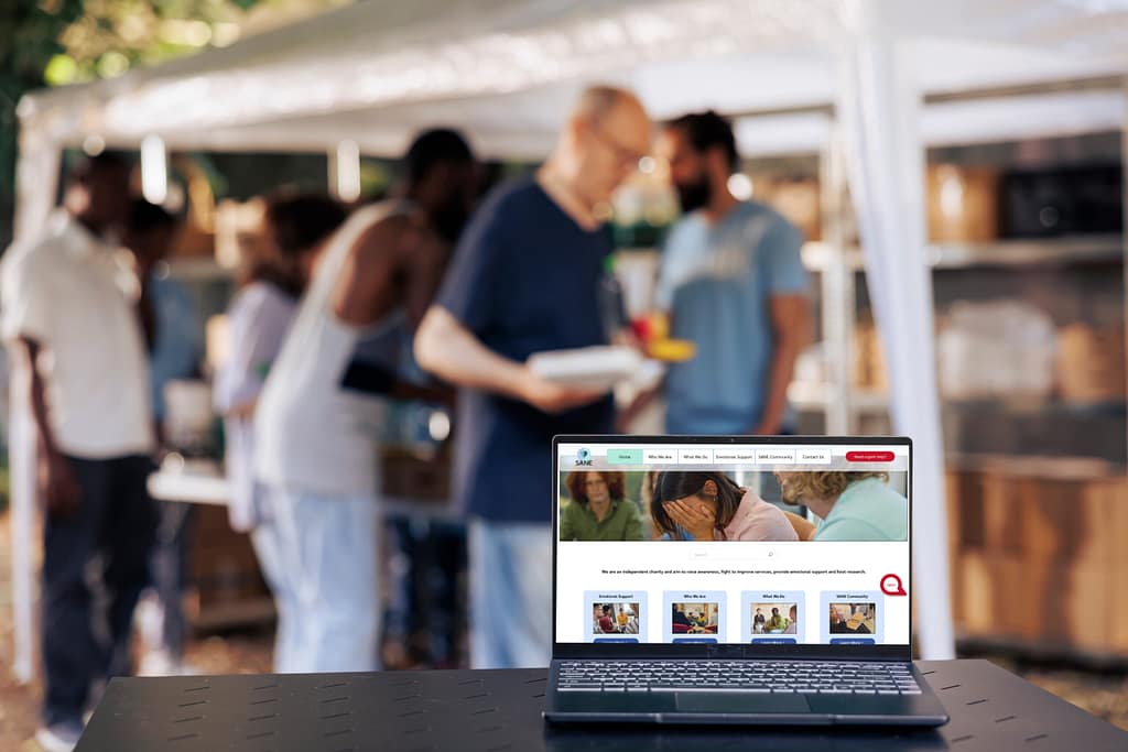
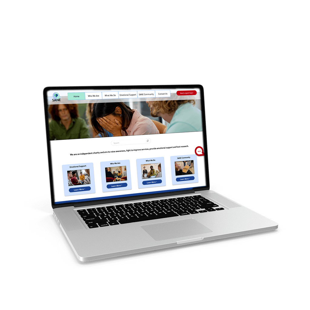
FINAL HIGH-FIDELITY WIREFRAMES
Our group crafted high-fidelity prototypes for both desktop and mobile versions of the SANE website. We approached this mobile-first to ensure responsiveness across all devices and we aimed to provide a user-friendly interface to allow visitors to effortlessly find what they are looking for. We used a warm, inviting font along with vibrant colours, engaging visuals and high quality stock imagery where the prototype captures the essence of what SANE is all about, inviting them to reach out to the organisation.
The mobile prototype is optimised for users, since our research showed that majority of users seeking mental health support will be trying to reach out via their mobile devices and we wanted to ensure that the website was optimised for mobile devices first. Ensuring seamless accessibility and a positive user experience across various screen sizes. We still retain the website’s core elements while making efficient use of limited screen space. The intuitive navigation and clear call-to-action buttons allows visitors to easily find the information they need.
MOBILE WIREFRAMES (HI-FI)

DESKTOP WIREFRAMES (HI-FI)

Both prototypes demonstrate meticulous attention to detail and we ensured consistent branding elements and a blend between stock imagery and appropriate use of typography. The prototypes serve as a strong foundation for the redesign of SANE.org.uk, therefore empowering the organisation to effectively communicate what it is about and encourage users to reach out for help.
FINAL PROTOTYPE
Below you can find the link to the final prototype.
REFLECTION
FINAL THOUGHTS
- Strong collaboration using Slack, and Zoom with scheduling management
- Learning from each other as we worked through the project
- Handling the loss of a group member to absorb the workload for project completion
WHAT'S NEXT?
- To test and develop a tablet iteration of the site design before growing the wider content to include mental health research and governance consideration
- Consider further Bootstrap design elements in comments, or UI that allows the developer to create a working end-deliverable easily
- For all prototypes to have detailed micro-interactions with functioning forms for data entry, toggle button options, data validation
- Accessibility consideration with light/dark modes, and dyslexia compliant font use throughout the site.