EazyFly: Travel Planning With A Mobile App
PROJECT OVERVIEW
PROBLEM:
Travellers find the process of planning trips abroad challenging, as there’s a lot of information they need to consider such as travel restrictions, political climate, time constraints, and the booking process. This can be overwhelming for the traveller if there’s knowledge gaps, making it more likely for a mistake to be made. How can we make the process more efficient to minimise the chances of travel plans failing?
SOLUTION:
Create a mobile app which retrieves the required information needed to ensure a pleasant travel experience for the traveller. The app can help users make informed decisions without needing to rely on external media or sources to help them make the right travel decisions and ensure they get the best value for their time. The entire trip can be organised in one single app which incorporates group chat functionality, roaming data and different widgets within the app to help guide travellers step by step.
IMPACT:
After redesigning the high fidelity prototype, the outcome was decreasing the user time from creating an account with an original time of 60 seconds down to 24 seconds on the new iterated high fidelity prototype.
MY ROLE:
UX Designer (Individual Project), UX Researcher
TOOLS:
Figma, Google Forms, In-Person Interviews, Zoom Interviews, Audio Recordings
MOBILE PROTOTYPE:
The app will be designed using Figma and will consist of multiple pages with information catered to the specific requirements of travellers who want a customised experience that’s unique to their circumstances.
GOAL:
The goal is to be able to create a mobile app for travelling where it provides users the different options that are tailored to the user’s preferences and requirements. Some travellers know exactly what they want out of their trip but other travellers want a structured itinerary catered to their preferences without relying on external sources.
MY ROLE AND RESPONSIBILITIES:
To analyse the benefits and disadvantages of existing smartphone apps and try to correct the weaknesses of existing travel apps with my prototype design. I will be doing this by carrying out research through interviewing frequent travellers from diverse backgrounds and collating all their insights into one data set. The data set will be used to guide the process of building the mobile app for travellers that aims to solve the pain points based on the data from the interviews.
TIMELINE:
4 weeks
RESEARCH
I began my project trying to understand the pain points of travellers when planning their trips. I conducted user tests to better understand the user pain points. From there, I developed a user persona based on the data retrieved from the affinity diagram and empathy map that I created. I began my study with five one-to-one user interviews and online surveys, with users from both London and Birmingham, UK.
- Online Survey
- Through Google Forms
- Posted to the UI/UX Bootcamp general slack channel
- At least 7 responses in 48 hours
- User Interviews
- 5 user interviews with candidates that corresponds to the user persona
- 5 Client Stakeholders interviews
- 10 users in a single group session
- At least 10 open-ended questions & 3 follow-up questions
OBJECTIVES
- As a user researcher, I want to understand the user’s thought patterns and the different factors that influence their decision on how they make their travel plans
- As a user researcher, I want to understand the user’s perception towards what makes the travel app eye-catching for the users and find out how travel company apps can stand out from competitors to increase engagement rates
- As a user researcher, I want to understand the ways of making the user experience for users as intuitive as possible and discover ways to help the user reach their end goal in fewest steps as possible
- As a user researcher, I want to find out about the motivations for solo and group travellers, better understand their preferences, wants, needs and their motivations for making their decisions.
- As a user researcher, I want to understand how I can ensure a positive travel experience for everyone involved
PROTO-PERSONA

USER:
Larmar Larenza
BIO:
33 years old; single man; full time doctor; lives in East London with flatmates; commutes 2 hours a day to/from work with London Underground tube; cat owner- Lilly
LIKES:
Animals; Travelling; Parties; Socialising; Meeting new people; Football; Being Organised; Getting tasks done; plans all his events and social life; trying new foods and outdoor recreation activities; solo and group travelling to different countries, being spontaneous in outings and plans; going on dates with different women
DISLIKES:
Bad weather; commuting; last minute cancellations; misinformation on external websites and apps; unreliability; wasting time unnecessarily; poor customer service; organised chaos in group settings; multi-tasking; being alone; accommodation left in a poor state; indecisiveness between people
INTERVIEW PLAN
The following questions were used in my user interviews:
- What is the step by step rough process you follow when planning your holiday trips and why do you plan your holidays this way?
- Are you spontaneous and go with the flow when deciding travel plans or do you prefer having a structured routine and planning events beforehand in advance?
- Why do you like to be spontaneous with your planning? / Why do you prefer to have a structured plan for travel?
- What are the biggest pet peeves for you when planning travel trips abroad and why do you consider those problematic?
- What is the most challenging aspect for you when planning trips and why do you find that challenging?
- Why do you find these aspects challenging and what are you currently doing about it?
- What are your biggest concerns when wanting to travel abroad to different countries and why do you consider these points as concerns?
- What is the most stressful part of the trip for you and why is that aspect of the trip stressful?
- What are you currently doing when planning your trips?
- What apps do you use when planning your holidays and can you tell me the biggest problems and challenges you face when using these existing apps?
- Is there anything you would like to see an improvement on with the existing travel apps you use and why should these changes be made?
- What motivates you to travel and what does travelling abroad mean for you? Why do you want to travel to these locations?
- Which problems do you hope to see resolved for users wanting to make travel plans and travel abroad in future travel apps?
- How do you communicate with your partner or friends when travelling together and what are the biggest challenges you face when doing this?
METHODOLOGY:
- Online Survey using Google Forms
- Facebook, Instagram, Messenger
- User Interviews – 5 Online Interviews
- 14 Questions, 9 Open-Ended, 4 Probing Questions, 1 Follow-up Question
USER INTERVIEW INSIGHTS
From here, I combined all of my feedback into the user insights, and eventually into the affinity diagram shown below.

AFFINITY DIAGRAM

I utilised the information from the affinity diagram to create an empathy map to better understand how to empathise with my interviewees and the persona.
EMPATHY MAP

USER PERSONA
I created the character Larmar Larenza for my user persona. Larmar is similar to my proto-persona but has all of his goals, wants, and pain points I learned from my user interviews and survey feedback. Larmar wants to be able to customise his vacation with an itinerary that is tailored to his preferences. He inputs his data and the algorithm shows him recommendations based on what he likes.


DEFINITION AND IDEATION
USER INSIGHT STATEMENT
Larmar, a 33-year-old extroverted and sociable single traveler, seeks new experiences and friendships abroad. He values building relationships, enjoys diverse cultural interactions, and is selective about events to avoid boredom or loneliness. He plans activities that align with his personal development goals and looks for like-minded individuals to expand his social circle and potentially find a life partner.
From user interviews, we’ve learned that travel group members often have differing activity preferences, leading to conflicts. Larger groups face challenges in coordinating flights, hotels, and itineraries. We propose a travel app that offers personalized itineraries catering to all users’ preferences, ensuring information accessibility and reducing conflicts. This app will provide flexibility and freedom, helping travelers optimize their experiences and enjoy their holidays without issues.
PROBLEM STATEMENT
Finding social activities while traveling abroad can be challenging due to language barriers and unclear event information. Existing apps like Eventbrite and FatSoma don’t always cater to travelers’ specific preferences or offer international options. Relying on Google Search or social media for planning is time-consuming and tedious. Solo travellers like Larmar need a way to plan itineraries with activities and events that match their interests and preferences.
1) How might we… improve the travel experience and optimise preferences for solo and group travellers so that they aren’t wasting time and money google searching
2) How might we….help the user decide which activities are worth doing or where to go to once they’re at their destination?
3) How might we… reduce the conflict between group travellers when deciding which activities to do due to differences in wants and preferences?
4) How might we… provide an itinerary that is tailored to the needs and wants of the travellers using the app?
5) How might we… help solo travellers plan their trips so that they’re able to participate in the activities they want to do and attend the events that will bring them closer to their objectives?
6) How might we… determine whether the goals have been met for the travellers using the app?
7) How might we… ensure that the user doesn’t face any problems at airport security when travelling with hand luggage?
IDEATION - I LIKE, I WISH, WHAT IF?
Once I defined the problem and gathered all the information from my research, I created an Ideation table (I like, I wish, What if), voted on the best ideas along with a feature prioritisation matrix to help identify the features that are most helpful to the users. I then created a UX scenario, value proposition, user journey map and a storyboard to illustrate the user experience emotionally.

FEATURE PRIORITISATION MATRIX
I used the 2×2 MoScOw matrix with the variables ‘Complexity’ and ‘Impact / Priority’ to prioritise the most important features for the travel app. From here, I figured out what should be prioritised.


VALUE PROPOSITION
“Save time and money on travel planning with EazyFly. Our AI-powered app creates tailored itineraries, handling all the details so you can relax and enjoy your holiday stress-free.”
EazyFly is a travel planning app for all travelers, offering tailored itineraries, flight and hotel bookings, event searches, and social connections. We prioritize affordability and personalized experiences, making planning easy and building a community of like-minded travelers. Positive user feedback supports our vision and fosters trust.

USER SCENARIO

USER STEPS
Larmar wants to party and meet new people in Mallorca, Spain, but his friends are unavailable or uninterested. Disappointed, he decides to travel solo but feels anxious and stressed about planning the trip alone and meeting like-minded people. 😞
Larmar is scrolling on his Instagram feed and comes across a sponsored advert which talks about planning holiday trips that are tailored to the user’s preferences and promises to help users have the time of their life whilst also saving time and money. 😮
Larmar feels skeptical at first and thinks that the app is too good to be true, but he feels that he hasn’t got any other choice and doesn’t want to miss out on the Mallorca experience. He decides to give it a go and downloads the app from the App Store. 🤨
Larmar creates an account and inputs all the data into the app where he is prompted to answer some questions. The app uses AI technology and some algorithms to generate a tailored response to the user. He feels a buzz of excitement as the responses start loading up. 😁
Larmar has a complete itinerary with flights, hotels, and activities booked for Mallorca. Upon arrival, he joins the EazyFly community and connects with like-minded guys. Leading the group, he enjoys boat parties, bars, beaches, and attractions, leaving Mallorca with new connections and happy memories. 😀
STORYBOARD
I created a storyboard featuring Larmar. This storyboard gives a better visual to Larmar’s journey when planning his trip to Mallorca, Spain via the ‘EazyFly’ app.

USER JOURNEY MAP
The journey map shows Larmar’s emotional ride when it comes to planning his vacation. He feels overwhelmed until he comes across the ‘Eazyfly’ app and suddenly he feels a lot better about his situation.

COMPETITOR ANALYSIS
DIRECT COMPETITORS
- SkyScanner
- Booking.com
- Expedia
- AirBnB
- TripAdvisor
INDIRECT COMPETITORS
- Eventbrite
- Meetup.com
- Google Translate
- Google Maps
- Uber
I conducted research on the competition in the travel mobile app market, there were several direct and indirect competitors who had unique advantages. Competitors included apps like SkyScanner, Expedia and Eventbrite. Some competitors excelled in their features like robust search filters and search functionality. However, the main challenges identified were that there wasn’t any social components included in the existing travel apps, which lacked specific focus on comprehensive travel management which my app aims to provide. In the case of Larmar, we needed a travel app that helps him solve his issues with regards to his social life abroad.
WIREFRAMING & PROTOTYPING
After finalising the user flow, I transitioned to wireframe sketches where I highlighted the key features Larmar (From the User Persona) would need to meet his objectives.
TASK FLOW
- User Registration / Login
- User Profile Setup
- AI Recommendations
- Browse Recommendations
- Customisation Options
- Booking Integration
- Trip Management
- Feedback and Ratings
- Explore and Discover
- Customer Support

USER FLOW

I drew the sketches of each wireframe page required for the user flow. Shown below.


LOW FIDELITY WIREFRAMES
The transition from wireframe paper sketches to low-fidelity wireframes was a key step in the design process. The sketches helped me to figure out the layout, composition and aesthetic of the final version of the app. After completing the initial sketches, I was able to progress onto the more detailed prototypes and high-fidelity mockups. I had to ensure that both the users’ needs and the goals were met with the app based on the research I carried out earlier on.

The prototype made in Figma shows the ‘EazyFly’ app from both a new user who has created an account for the first time as well as existing users to show what the interface would look like in both scenarios. For new users, they create an account and follow the step until they are directed to the Dashboard. Existing users go straight to the dashboard after 2 factor authentication. The user can log off from the account in the Prototype.
TESTING AND ITERATIONS
This was my first UX/UI Design project. At the time of making these wireframes and prototype, I was not aware of the crucial UI design elements as I am now along with the best practices of creating a style guide. With the high-fidelity wireframes, I introduced a colour scheme and icons to improve the visuals of the app compared to the low-fidelity wireframes.
I created a usability testing plan to get through the user flow on the mobile app prototype. I completed the usability tests for over 4 different tasks, producing lots of insightful feedback. The tests were carried out through Zoom and the main goal was to find out how users understood the layout and features.
GUERILLA TESTING PLAN
Objectives:
- Can a user successfully create an account and log in to the dashboard?
- Do users understand what EazyFly is about when they see the splash page?
- Can a user amend their preferences if they change their mind whilst in the creating an account stage?
Task:
- Create an account for ‘EazyFly’
- Accept / deny preferences when prompted
- Go through profile preferences and confirm you’re happy with it
- Log out of the dashboard once signed in
Feedback:
- Users were able to successfully create an account from the splash page and login to the dashboard ✔
- Users were able to successfully log out of the dashboard and go back to the login page ✔
- Users understood what the app was about from the splash page ✔
- Users were able to go back and amend preferences if they needed to in the account creation process ✔
- Users were not able to go back and amend the permissions if they changed their mind, no back button available in the Account Creation process ✘
- Two factor authentication screen feels like an extra step that can annoy the user so a message which welcomes the user back after sign in can make them more comfortable. ✘
- Some parts of the account creation stage were a bit confusing and overwhelming for the user, make it fewer pages and more straight forward to follow and less overwhelming. ✘
2 RECORDED USER TESTS
I recruited at least 2 different users to test out the prototype. The tests were conducted virtually using screen recording software because of convenience and referring back to the video evidence when working on iterations for the prototype.


I was able to put together the usability testing notes and created a guerilla testing matrix to figure out the iterations that needed to be prioritised.


KEY LEARNING FROM USER TESTING
During user testing, I learned to balance making the design informative and intuitive while catering to diverse users. Some users were more patient with permissions and sign-ups, preferring different levels of clarity. I realized that design ideas can be perceived differently by users, so it’s crucial to test with a large, diverse sample. Feedback highlighted the need to avoid overwhelming users, breaking the account creation process into manageable chunks, and spacing out permission requests. For the high-fidelity prototype, I’ll focus on improving navigation, permissions, and simplifying the sign-up process based on user feedback.
ITERATIONS MADE BASED ON USER TESTING
- Added back button to the top navigation bar to allow users to go back and enter their permissions again if they accidentally clicked ‘Deny’ or want to amend their permissions
- Kept the Hamburger menu in and removed the gear icon to make it more clear to the user where they need to navigate to for logging off.
- Tweaked some of the Back and Skip buttons where I provided the option to skip their preferences and go straight to the dashboard if they wanted to amend their profile preferences later, given that not everybody will have the time to fill out their preferences in that moment because they may be busy and may want to amend it later if given the option.
- Having just one permission popup rather than having 3 different permissions popping up all at once to make it less overwhelming for the user and also adding a back button to go back to the home page if they want to cancel the create account process and do it later.
- Adding in clearer images for the tick and plus icons to show the user that the icon represents an action to be completed and also make it less confusing.
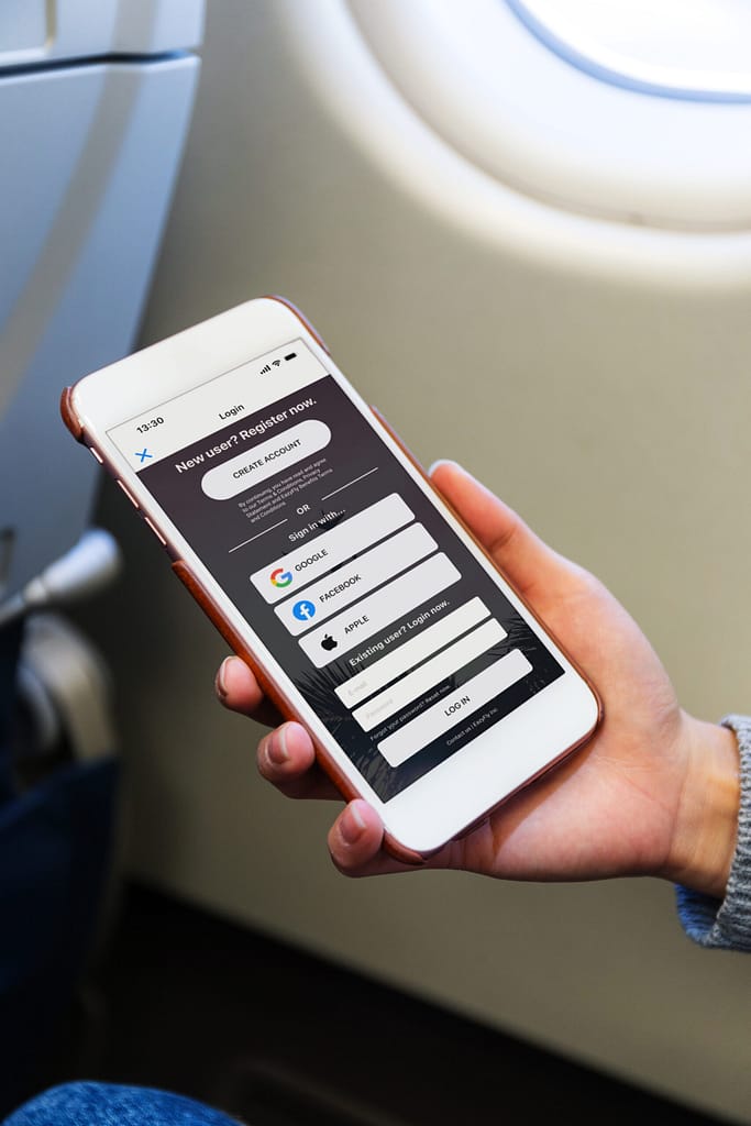
- Have the create account show up at the top and login for existing users at the bottom so it’s easier for first time users to navigate to the create account rather than having to scroll to the bottom to create an account.
- Have added fewer pages for the account creation stage so the user has fewer steps to take when completing the account setup process.
FINAL HIGH FIDELITY WIREFRAMES
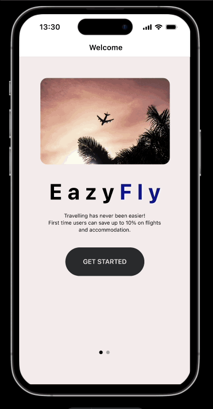
During the design process, I went for the colour scheme of blue, dark grey and lighter grey to convey a friendly, adventurous vibe and truly reflects the concept of travelling and fun. I played around with the different colour palettes and combinations until I found one that I was satisfied with, and captured the vibe I was going for. The colour scheme elevated the visual impact I was looking for and immersing users into the world of travel. I have displayed the high fidelity wireframes below which I came up with after the 5 A/B testings between the low fidelity wireframes and this one. Four out of the Five tests preferred the high fidelity version more and felt the journey was much more smoother compared to the low fidelity version.

FINAL PROTOTYPE
REFLECTION
FINAL THOUGHTS
Excitement and Learning:
- The project was insightful, teaching many new UX design principles and concepts.
- Successes and feedback provided valuable lessons.
Finding a USP (Unique Selling Point):
- Differentiating the app from existing ones like Expedia and SkyScanner was challenging.
- Mistake: Basing the app on personal experiences rather than proven research.
- Needed: Deep user research to understand the target audience and market gap.
- Realization: Iterations are essential to develop a unique product beyond an MVP.
Competitor Analysis:
- Wished for more thorough research on existing apps’ strengths and weaknesses.
- Inspiration from similar apps led to a lack of unique features.
- Importance: Detailed competitor analysis to focus on core features.
New Learnings:
- Embracing mistakes and the iterative nature of design is crucial.
- Adopting a designer’s mindset takes time and practice.
- Seeking feedback and support is vital for improvement.
- Design iteration is ongoing, regardless of experience level.
AREA FOR IMPROVEMENT
If I had more time and resources, these are the improvements I would make:
- Include a larger sample size for the Google Forms questionnaire, this would ensure the validity of the data and more accurate findings. The bigger the data set means the more information we have to ensure that we are solving the problems for users and meeting their requirements
- Interview people from different backgrounds as opposed to just people living in the UK. Having different insights and perspectives can help me to understand the bigger picture and understand how to solve the problems on a global scale.
- Add more points and insights to the Affinity Diagram and Empathy Map to showcase a more detailed persona
- Having more user persona profiles to showcase a variety of different users from different backgrounds and circumstances to understand the best way to meet the requirements of users we can target. Including single travellers, people who are married with children, elderly couples etc.
WHAT'S NEXT?
Future Projects:
- Embrace mistakes as feedback and ask for help when needed
- Take manageable steps to overcome challenges and empathise with different perspectives
- Use time management strategies to balance research and analysis
- Aim for continuous improvement and iteration based on feedback
The Travel App
- Continue to iterate and add more wireframes and prototyping to the existing prototype and try to achieve all the objectives I set out from my research objectives
Key Takeaways:
- Use time management strategies to balance research and analysis
- Aim for continuous improvement and iteration based on feedback
- Emphasise thorough research and competitor analysis
- Accept and learn from mistakes
- Seek continuous feedback
- Focus on iterative improvements and time management